Intro
Left as is
The brandmark is straightforward and impactful. I left this alone.
Case study · Executive communications
A founder came to me with a demo deck, a few hours ahead of his conference presentation. The information was there, the vibes were not. I took the bullet points, plain text design, and a table with no visual thread, and reworked it into a deck that could carry a snappy 20 minute session.
Below is a comparison of what I received (left) and what I produced (right).
← Back to about
The brandmark is straightforward and impactful. I left this alone.
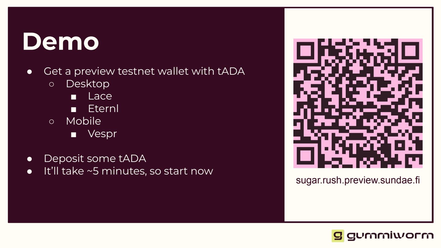
Before
After
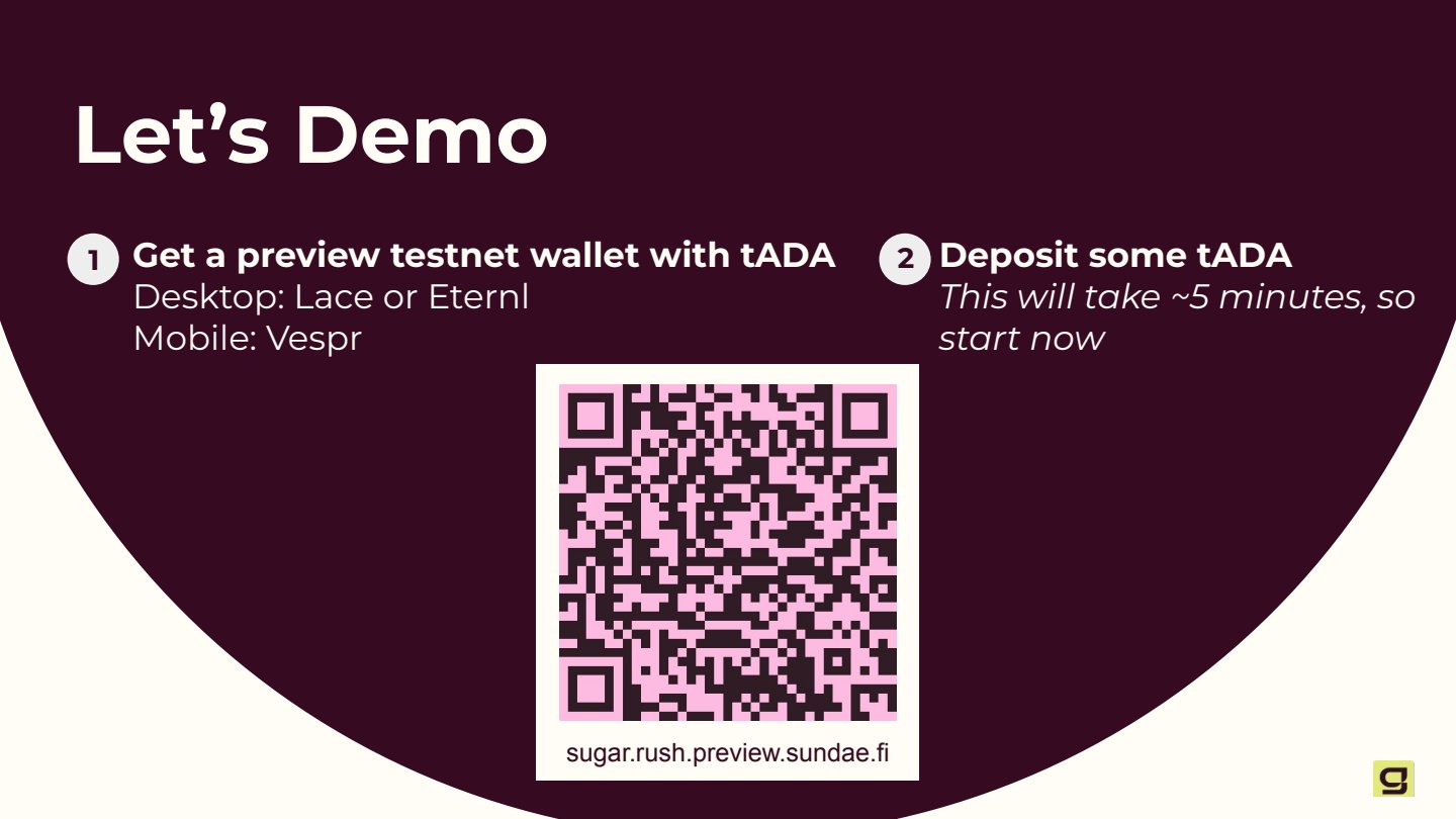
The bulleted list wasn't an intuitive set of directions, especially for busy technical attendees likely half-distracted as they enter. I tightened the call to action and centered the QR code.
Before
After
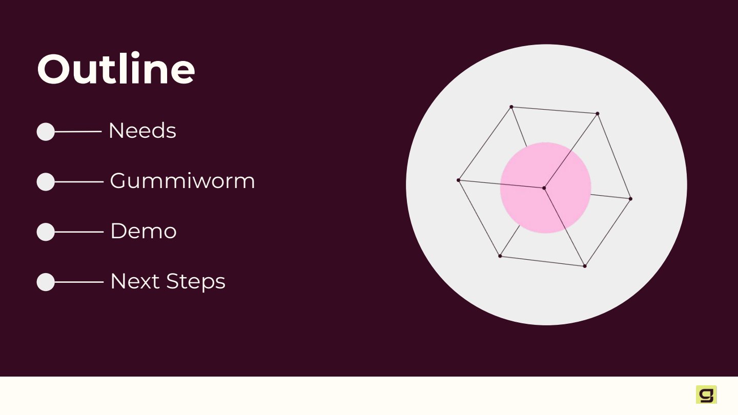
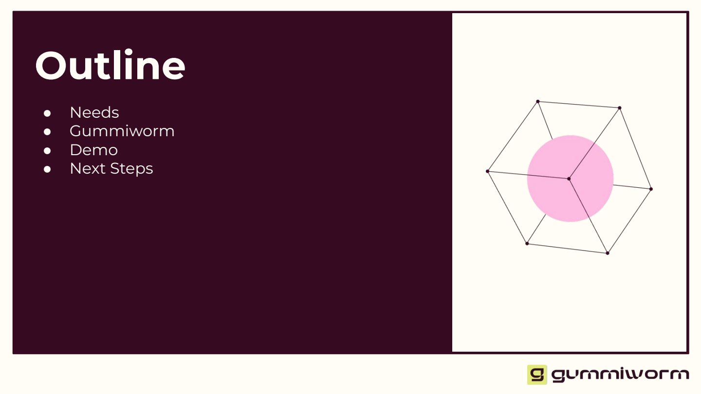
A bulleted list that doesn't feel distinct. It's a small moment in the presentation, but it sets the tone for the visual identity. I used bold markers to guide the eye across the slide, and pulled the wireframe graphic into a decorative element. This element guided the visual identity for the deck layout.
Before · slide 1 of 2
Before · slide 2 of 2
After · animated
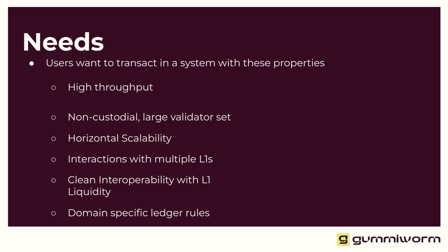
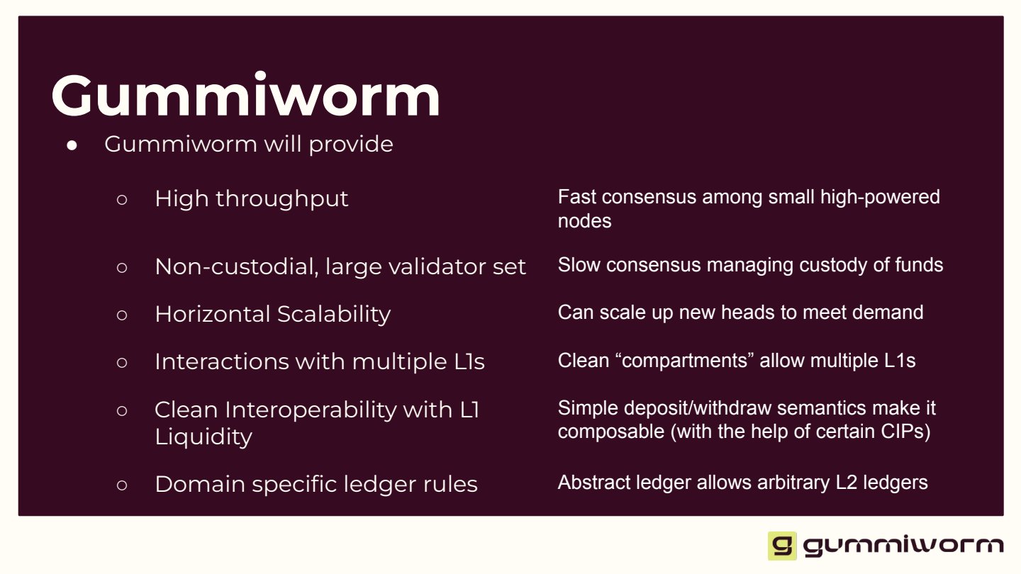
The heart of the talk, identifying user problems and corresponding solutions. I consolidated two slides into one, with animations that introduced each point as the speaker spoke. Then the direct side-by-side connects the problem to the solution, using symmetry to visually guide the listener.
Before

After
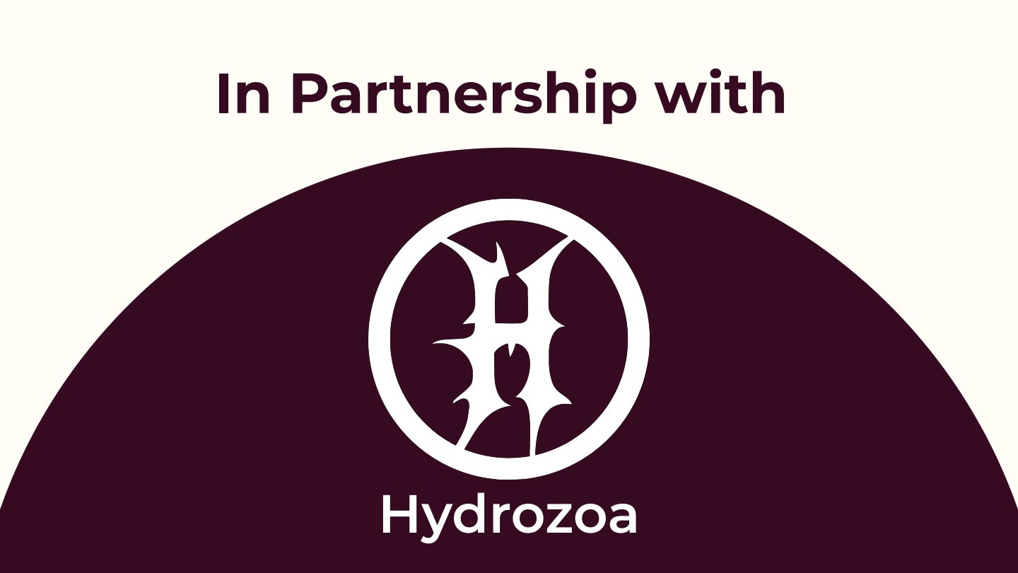
This announcement deserves its own moment. I anchored the partner logo within a half-circle frame, evoking the rise of a new venture.
Before
After
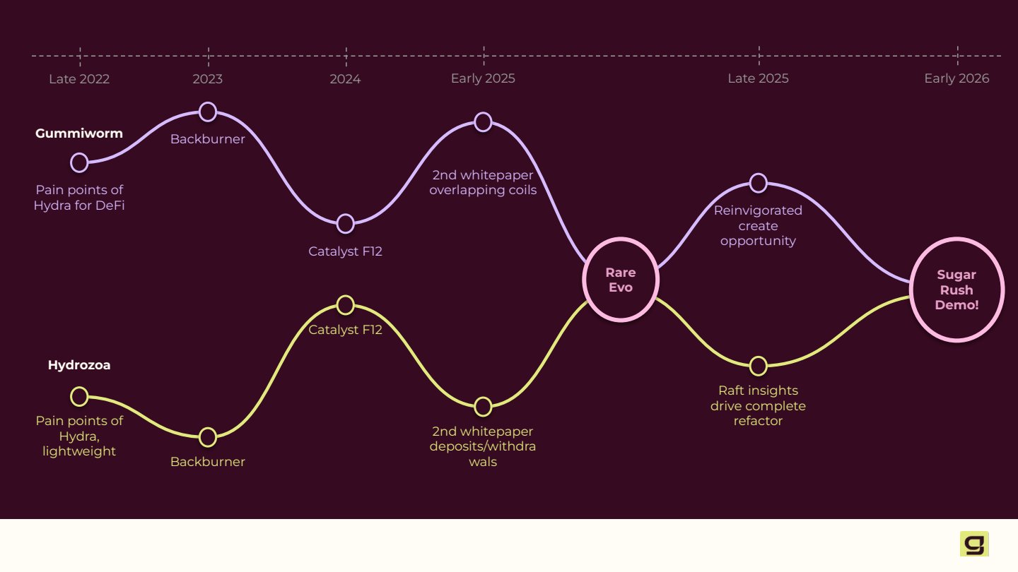
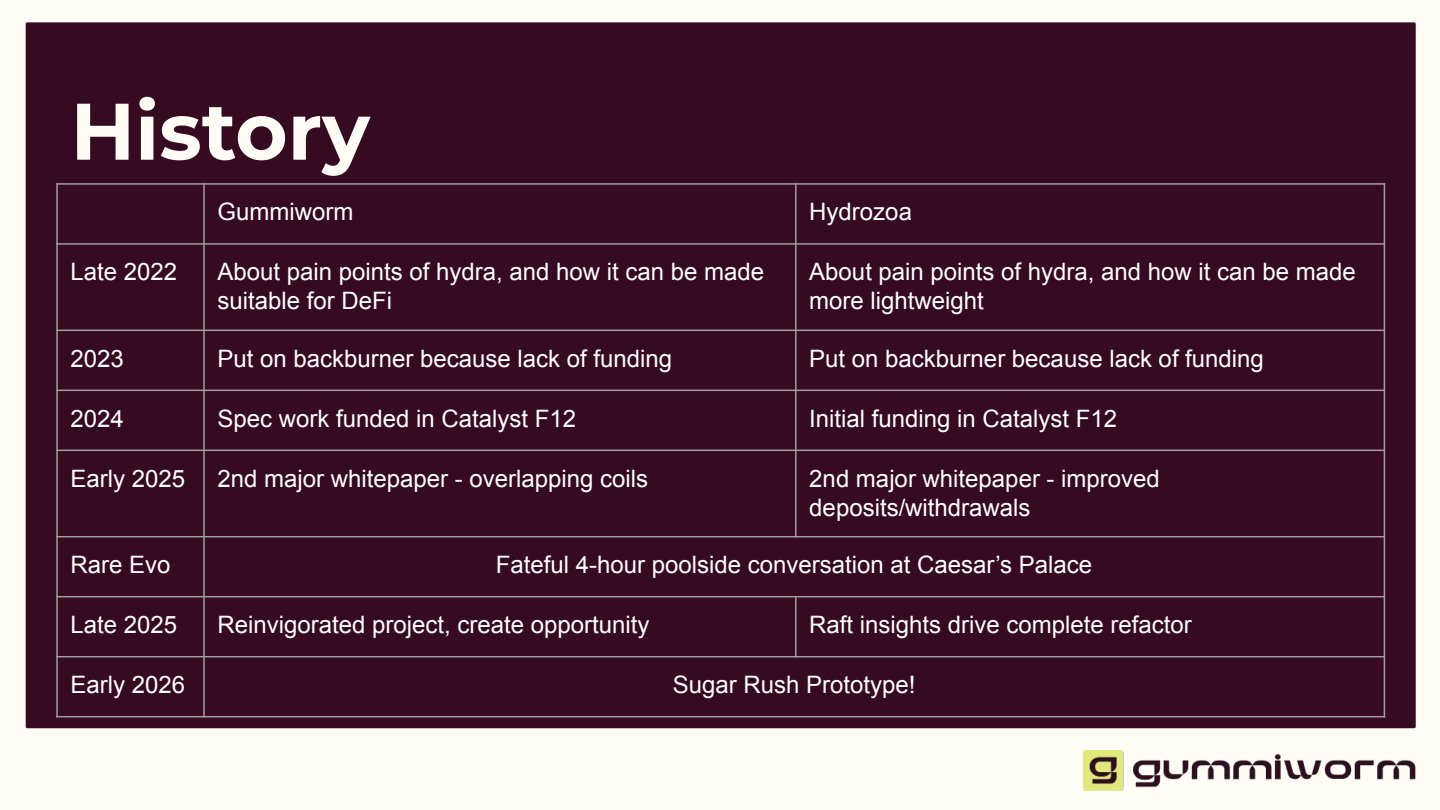
Telling the story of two companies that coincidentally had similar journeys is a fun moment of reflection. However, no one is going to appreciate a static table from the back of the room. We wanted to show how their journeys had run parallel for years until they found a common connection at an event, ultimately converging on the moment they find themselves in.
A closing slide that already had personality. I left it alone.
What I bring
Leaders don't have time to translate their own thinking into a deck. My job is to absorb what you're trying to say and hand back something you trust. Brain dump in, thoughtful presentation out.